Futura - Font of the future
November 2023
The design work for this typeface began in 1924 by Paul Renner, a German type designer and was released in 1927 by The Bauer Type Foundry. It was dubbed “font of the future” and quickly became popular in commercial use. Because of its appearance, it has been mistaken as a Bauhaus design but it wasn't because Futura is associated with the New Typography Movement that slightly predates Bauhaus.
In Nazi Germany, a typeface was closely tied to an organisations identity. Blackletter (Fraktur) was then established as the recognised official typeface for the party and all printed materials had to use it.
Nazis hated and rejected modern typefaces like Futura and called them "Entartete Kunst" (Degenerate Art).
Historical + Current Appearances
As one of the first geometric typefaces introduced in Europe, Futura’s appearance in the scene is well documented and some say it rivals Helvetica.
Germany
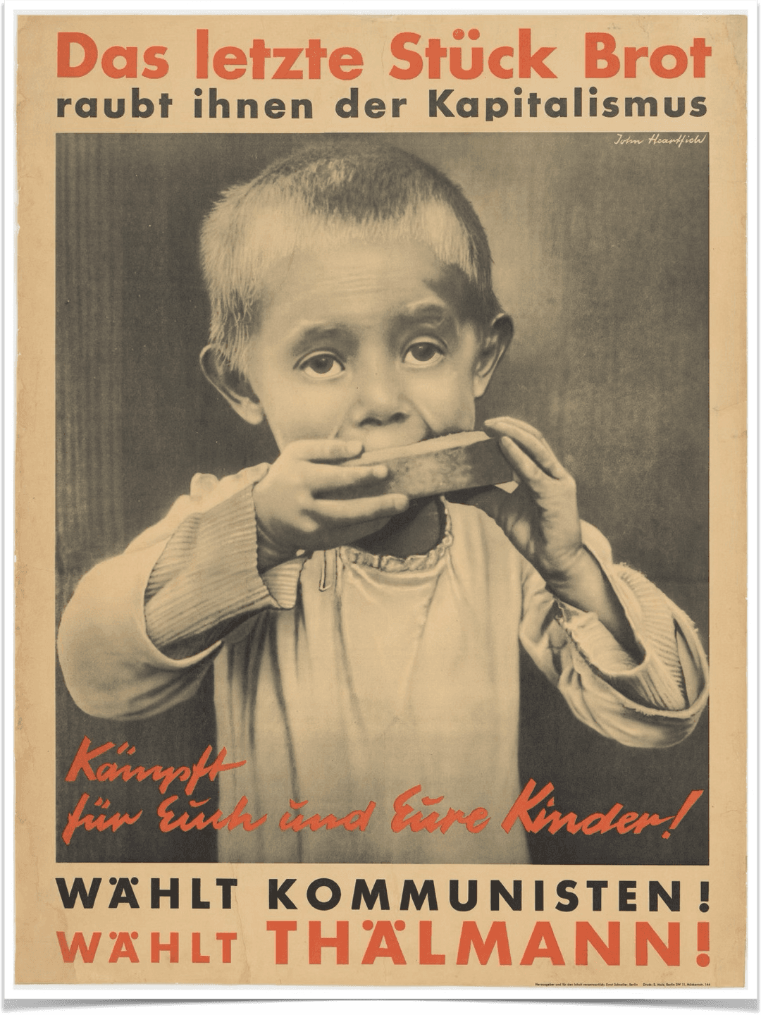
Futura started making an appearance in political campaigns. For example, Ernst Thalmann’s national election poster in 1932, Germany. Printers, mapmakers, and advertisers throughout Germany adopted the typeface in most of their prints in the 1930s. For example, the city of Hannover is known to rebrand all the official documents to be written with the Futura typeface. Fun-fact: Blackletter was banned in 1940 for it was rumoured to have Jewish origins. The new standard fonts included Futura due to its higher legibility over Blackletter.
Thalmann' s poster for the German Democratic Republic, Berlin
The United States of America
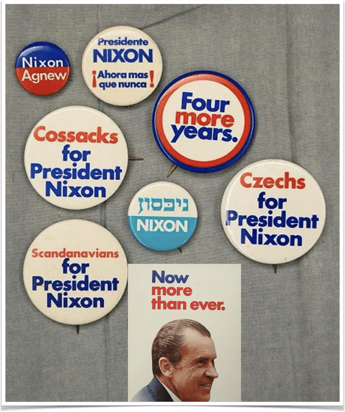
Richard Nixon almost exclusively used Futura in his 1972 re-election campaign.
Fun-fact: Nixon’s visual identity for 1972 re-election was the most comprehensive branding systems used by a presidential candidate. Futura’s popularity fell in 1974 after his resignation, but this similar branding system is seen again in Barack Obama’s 2008 campaign.
Samples of branding materials used in Richard Nixon's re-election campaign.
Advertising & Design
Futura appealed to many advertising agencies because of its simplicity and clean aesthetic. The typeface works well in headers, body text and even larger displays.
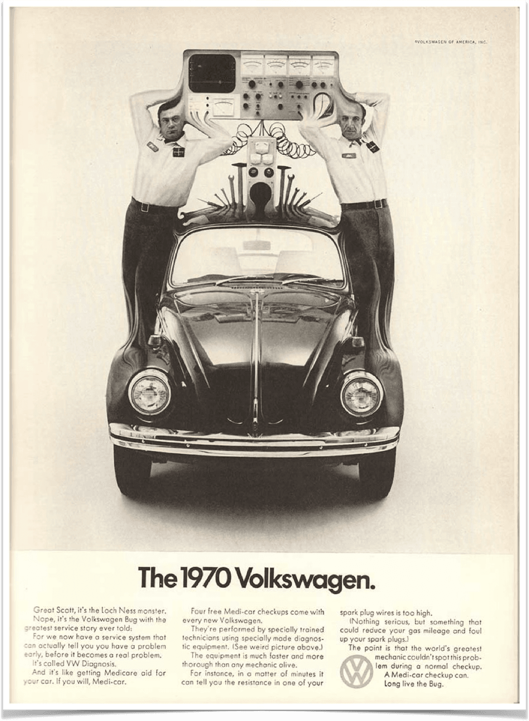
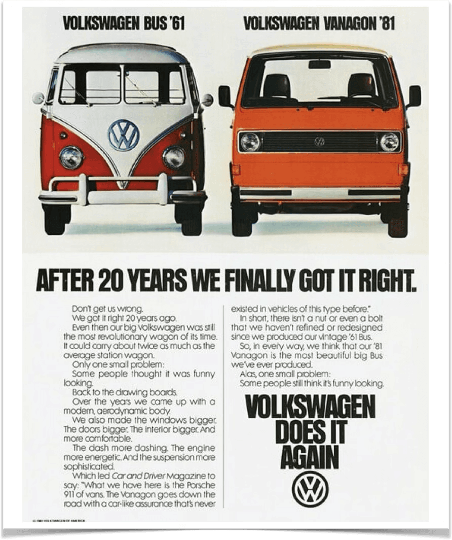
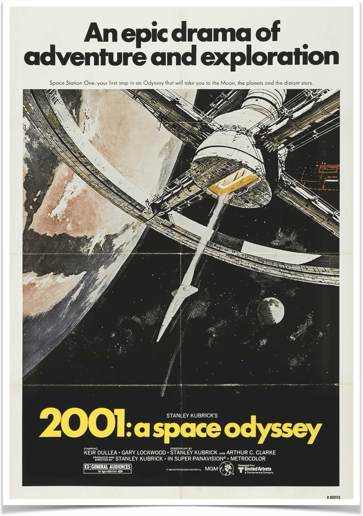
As a German car manufacturer, Volkswagen appreciated the versatile nature of Futura and used it for their branding and promotional materials. In the film industry, we have Stanley Kubrick. A famous film director known for favouring Futura in promotional materials for his films. Futura was also his preferred typeface for title cards.
Branding
Futura’s geometric and clean design makes it preferable choice in logotypes, posters and packaging. A wide range of companies use this typeface as part of their brand system. High-end brands (Nike, Louis Vuitton, Omega, Supreme and D&G), food franchises like Domino’s, and even design consultancies such as thefutur.
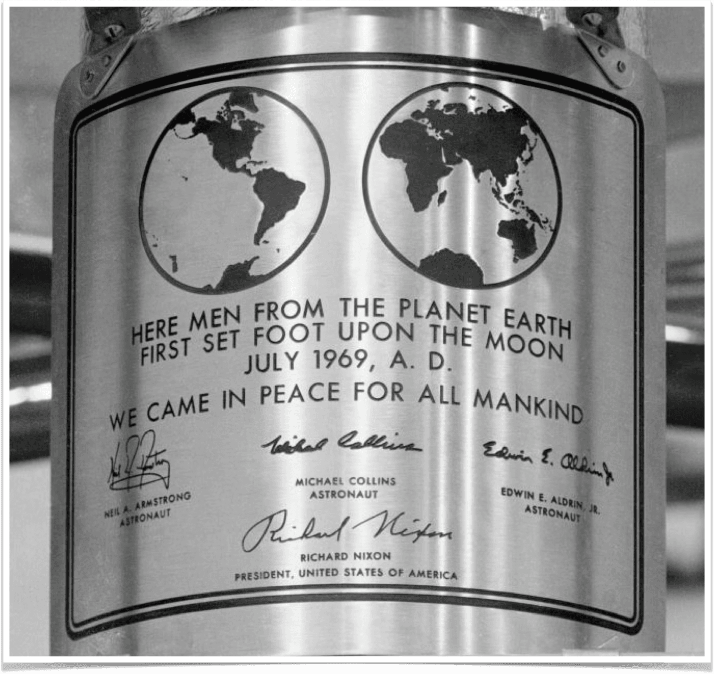
Futura also takes the crown as the first font to land on the moon in 1969. Apollo 11 used Futura as the typeface for the words on its plaque that read:
“HERE MEN FROM THE PLANET EARTH FIRST SET FOOT UPON THE MOON JULY 1969, A. D.
WE CAME IN PEACE FOR ALL MANKIND”
Commemorative metal plaque with engraved and enamelled design of Apollo 11 lunar module. Credit: Smithsonian National Air and Space Museum
Style + Anatomy
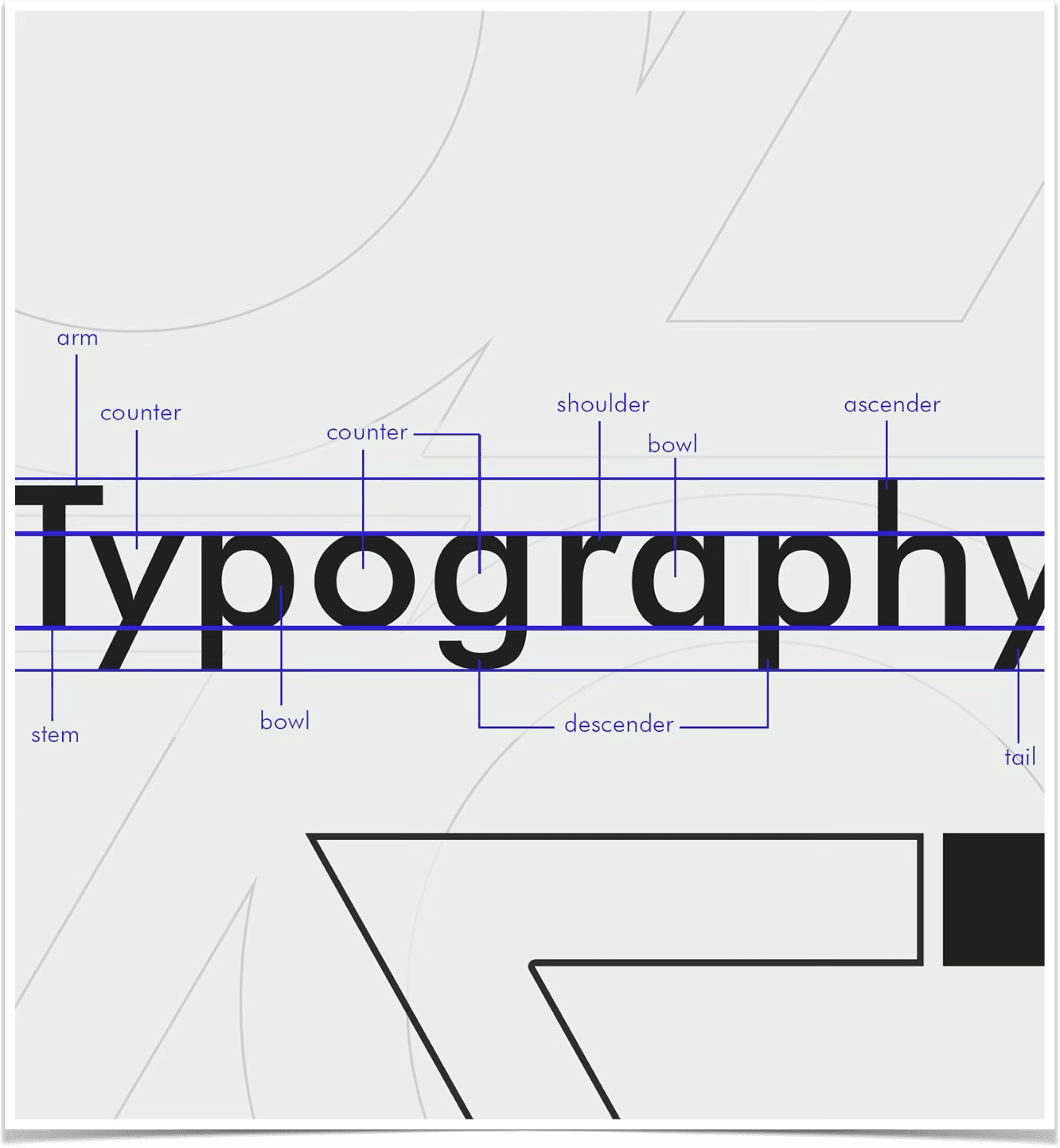
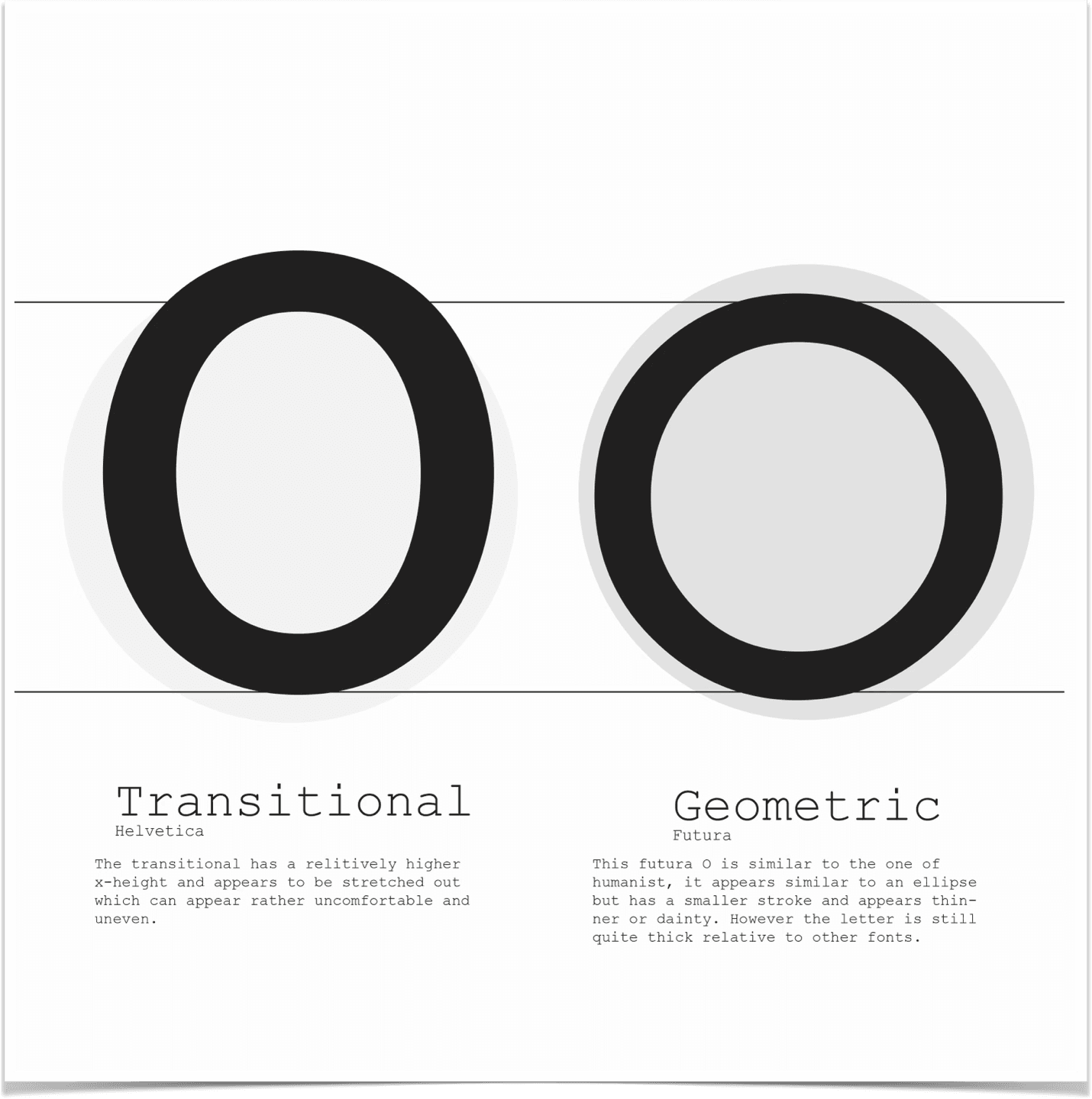
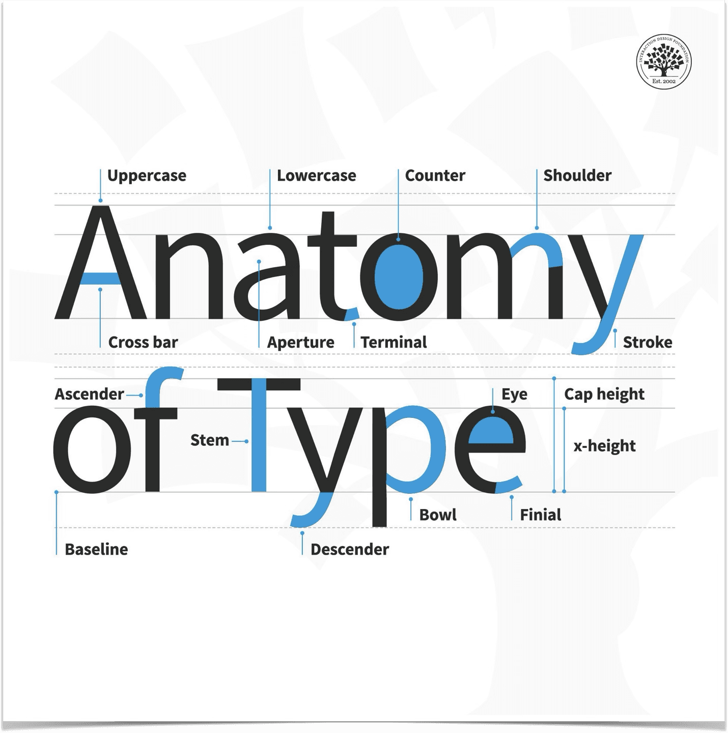
Futura is one of the most aesthetic sans-serif typefaces out there. The appeal is found in Futura’s anatomy that reveals its clean geometry and even- width strokes. It is a modern and clean typeface designed without serifs (little shoes in typefaces like Garamond) and well balanced for use in titles, headers, subheads and body text.
Typographic blueprint showing different parts of type arrangement on uppercase and lowercase letters.
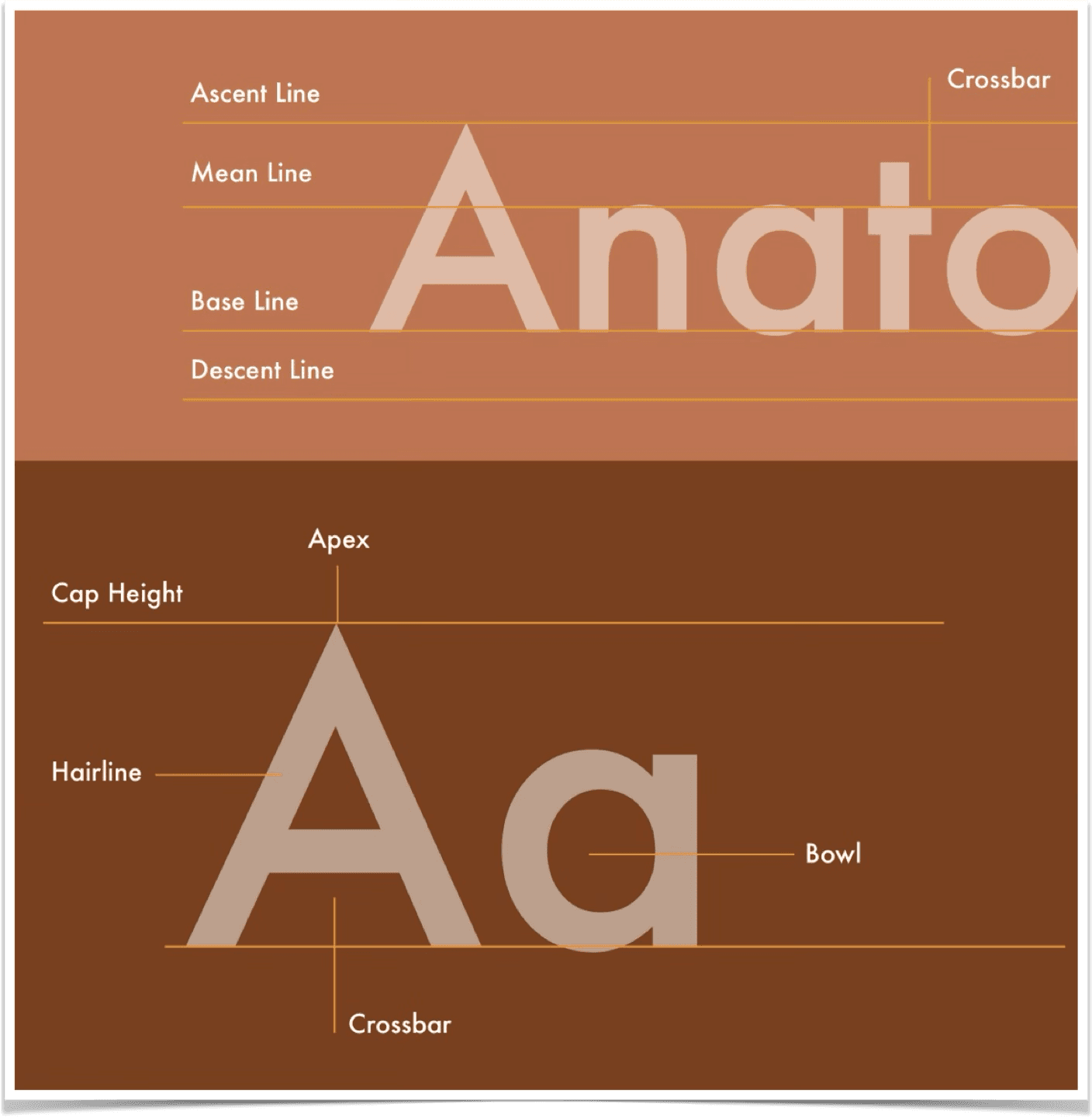
Futura’s appealing design comes from utilisation of geometric shapes. The clean and precise proportions paired with absolute symmetry makes it easy on the eyes. Part of its typographic anatomy is the noticeable low-contrast strokes. These strokes tend to have uniform width in each letter to maintain legibility as the typeface shrinks.
Left: Geometric comparison between Helvetica and Futura. Right: Illustration of a typeface's anatomy. Credit: Daniel Skrok / IDF
Futura in UI
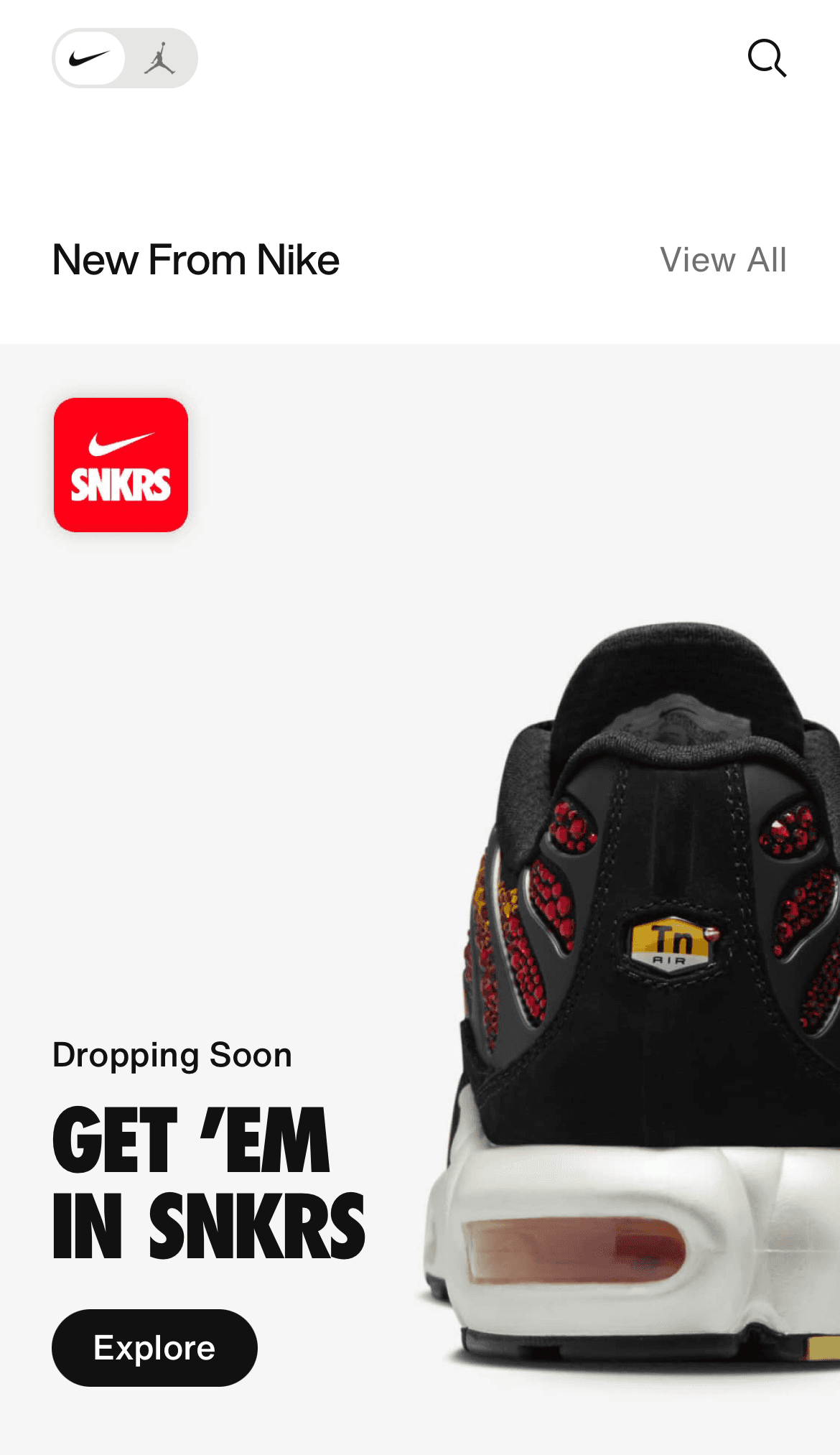
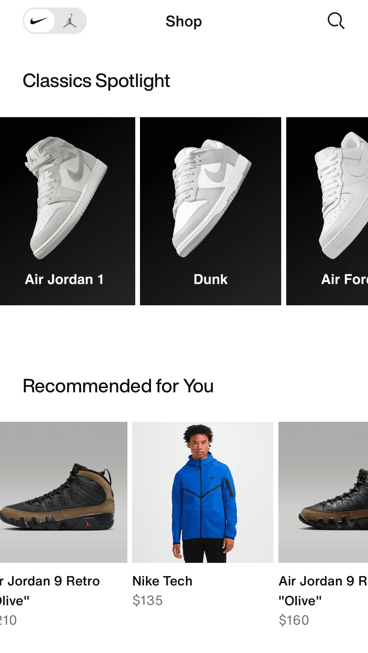
The clean and symmetrical nature of Futura makes it a suitable typeface for interface design because of its versatile legibility. More UX/UI designers should make use of this typeface and potentially experiment with it in their work.
Since its release in 1927, Futura has dominated the graphic design community and this will not stop any time soon. Websites and apps have also started utilising this beautiful font as part of their cohesive design system.
Application of Futura on different screens in the Nike app.
Closing Thoughts
Futura is a font that has a timeless quality attributed to it. Not sure if it's because of it's rich history, geometric design or simply because it's a sans serif font. Truth is, I don't know! What I do know however is the fact that any design that employs this font turns out to be minimal, clean and aesthetic.
A century later from it's creation in 1920 and this font still feels modern and relevant. Major companies such as Volkswagen were the driving force in bringing recognition to this minimalistic font, but props to all the designers who know how to use it well. If you're a designer reading and have never used Futura in a project, this is your sign to try it out.
Acknowledgment
Thanks to Prof. Cynthia Putnam for reviewing this essay and providing feedback. No AI was used in the contents and writing of this essay.
Resources + References
Extensis, DesignObserver, Medium, and Wikipedia.
